Case Study

Costsaver Blue Sky Redesign

Redesigned Costsaver’s digital experience across the homepage, trip pages, destinations, itineraries, and visual identity to make booking easier. The result was fewer visitors, but more of them booking.

RoleSenior Product Designer

CompanyBS&T (In-house)

ScopeResearch, Prototyping, Design Systems, Production Design

Timeline2024 to 2025

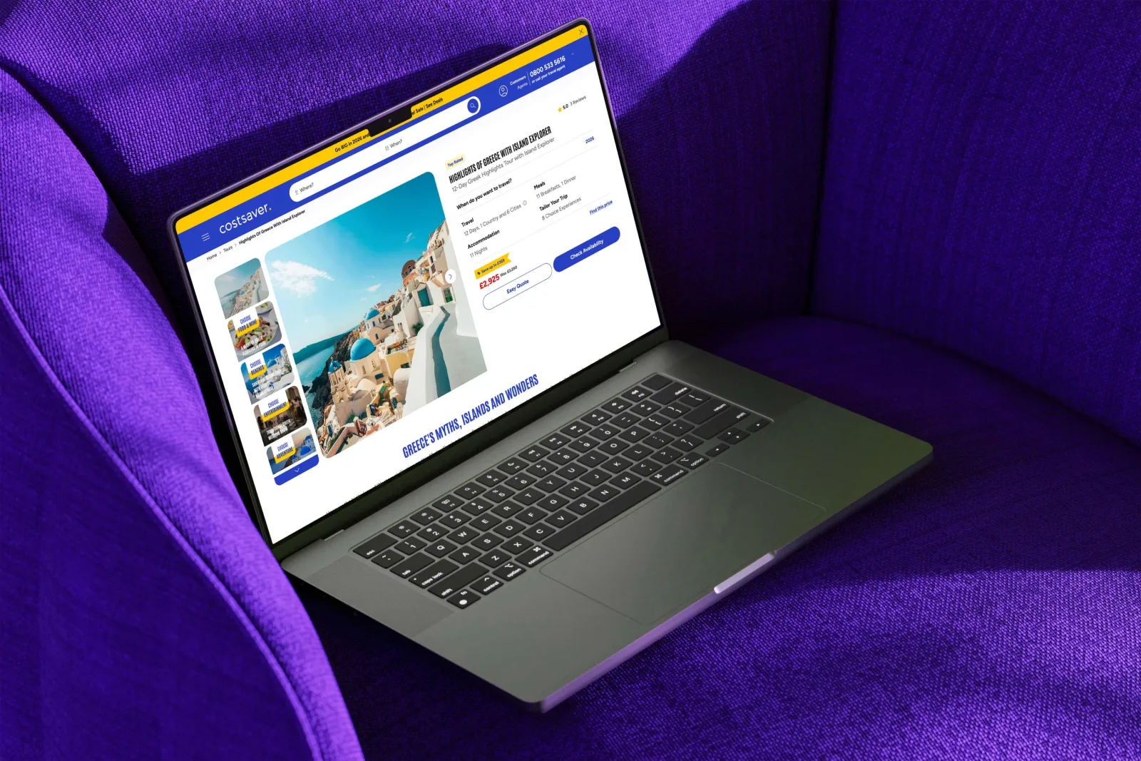
Costsaver website redesign hero image showing the new trip browsing experience

Transactions

+50%

YoY

Mobile booking share

+3pts

YoY

Trip-page engagement

+30.3%

YoY
01Context

Setting the scene

Costsaver runs affordable guided tours across the world and consistently brings in over 400,000 visits a month. Despite performing well commercially, the site had started to feel too close to other brands within the group, sharing many of the same components, layouts and interaction patterns.

At the same time, the brand team was working on updated print guidelines and a brochure redesign with another agency. My role was to lead how that new direction came to life digitally. I redesigned the visual language of the website, improved key customer journeys, and created a more flexible design foundation the team could continue building on properly over time.

ConstraintWCAG 2.1 AA compliance as the absolute minimum

ConstraintStakeholder pressure to launch quickly, with limited room for user testing and validation

ConstraintInconsistencies between approved designs and final development output

ConstraintSeparate design and development teams with indirect communication

02Research

What the data showed

Worked alongside a UX researcher to synthesise interviews, analytics, session recordings, and stakeholder feedback. Four clear issues kept surfacing.

My contribution

Research planning support

Helped shape the research plan and decide what to look for.

Analytics and behavioural analysis

Read analytics and session recordings for repeat patterns and friction.

UX synthesis

Grouped the signals into the four findings shown below.

Translating research into design

Turned each finding into a specific change to the journey.

  1. Finding 01

    Users were browsing, not searching.

    The homepage led with a search bar, but most visitors didn’t know where they were going yet. The experience assumed intent too early.

    Original Costsaver homepage leading with a search bar before users had decided where to go
  2. Finding 02

    Key decision-making content was disjointed.

    Trip pages split attention across imagery, pricing, and details, making it harder to quickly understand value. Users had to scan and piece information together before making a decision.

    Trip page before redesign with split attention across imagery, pricing and details
  3. Finding 03

    The core of the product was invisible.

    Choice Experiences were a core part of the product, but there was no clear way to explore them, compare options, or understand cost without doing the maths manually.

    Choice Experiences buried within the existing trip page
  4. Finding 04

    No system to hold the design together.

    Typography and colour had drifted across the site. There was no shared system in place, which made consistency hard to maintain and slowed the team down.

03Solution

What I changed and why

Mapped the end-to-end journey from discovery to booking, focusing on where the experience was breaking down and what needed to change.

User flow diagram mapping the end-to-end journey from discovery to booking

Change 01 · Discovery

Show trips before search.

Redesigned Costsaver homepage prioritising browsing with trips surfaced earlier in the journey

User problem

The homepage led with a search bar, but most arrivals hadn’t decided where to go. The search-led homepage killed the browse mood and pushed casual visitors away.

Key moves

  • Trip cards lead the page; search drops to a secondary entry point.
  • Inspirational content sits above conversion mechanics.
  • Browse and search both remain available, neither blocks the other.

Change 02 · Comparison

A date list that travellers can actually scan.

Dates and prices section before redesign with long unfiltered list
Before
Dates and prices section after redesign with intent-based filters
After

User problem

Travellers had to scan dozens of departures to find the one that matched their flexibility. Anyone shopping last-minute or on a budget had no shortcut, just a long list.

Key moves

  • Filters surface intent: definite departures, last-minute, popular, special.
  • Travellers can scan all departures at once.
  • Pricing logic sits alongside the date.

Change 03 · Decision-making

Decision content above the fold.

Redesigned trip page with pricing, highlights and key details brought above the fold

User problem

Trip pages buried pricing and key details under long imagery galleries. Travellers had to scroll past inspiration to reach the information that actually drove their decision.

Key moves

  • Pricing and key inclusions sit in the first viewport.
  • Imagery moves to a supporting role.
  • Decision content reads as one column instead of being split across modules.

Change 04 · Personalisation

Choice Experiences belong in a wishlist.

Redesigned Choice Experiences module with running cost and clear comparison

User problem

Choice Experiences were a core part of the product but scattered through the itinerary, with no clear way to compare options or see the running cost of selections. Most travellers never realised they could personalise the trip at all.

Key moves

  • Hearting an experience adds it to a visible wishlist with running cost.
  • Picking an alternative for the same slot swaps cleanly, no confirm dialog.
  • Removal is reversible, encouraging travellers to explore without commitment.

Interaction states

Choice Experience added to the traveller’s wishlist after hearting it

Added. Hearting saves it to the wishlist.

Choice Experience swapped out for another within the same time slot

Replaced. Picking an alternative swaps the existing one.

Choice Experience removed from the traveller’s wishlist

Removed. Unhearting clears it from the wishlist.

Change 05

Building a system that scales

The visual language had drifted, making consistency hard to maintain. A clearer system for type, colour, and components was introduced to support accessibility and speed up delivery.

Type system

Refreshed typography reference

Tap to open the full type system in an in-page viewer.

Colour pairings

AA accessibility reference

Tap to open the colour pairings audit in an in-page viewer.

04Results

Fewer visitors, more bookings.

The redesign focused on intent-driven travellers rather than casual browsing. Sessions dropped about a fifth year-on-year. The visitors who did arrive converted at a much higher rate, and revenue rose 54%.

Organic traffic, Sep to Dec year-on-year

The commercial impact

Revenue

+54.3%

Transactions

+50%

Avg. session duration

+48.9%

Year-on-year organic traffic and conversion comparison post-redesign

Organic traffic, year-on-year. Fewer users, more revenue.

All traffic, full 8 months year-on-year

On the surfaces we rebuilt

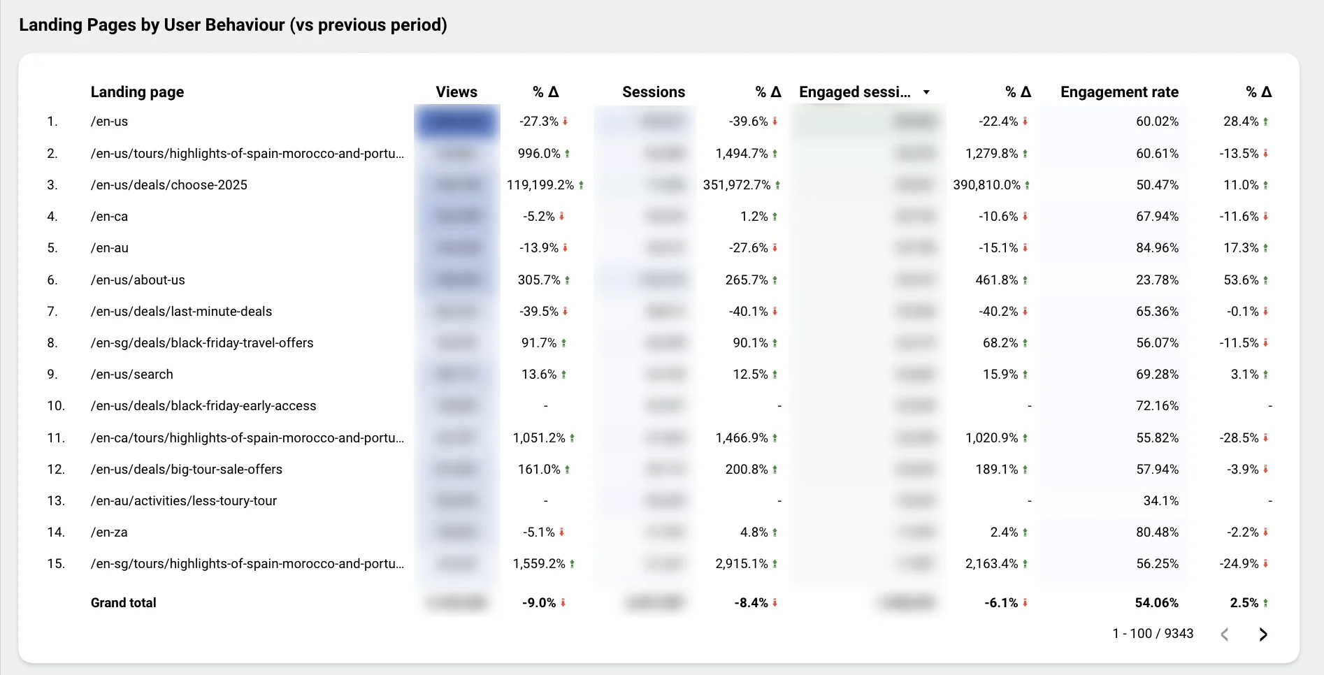
Engagement improved across the core templates the redesign touched. Time on the homepage more than doubled, with the biggest jump showing up on content pages.

Time on homepage

02:22

from 01:01 +132.8%

Time on content pages

01:44

from 00:31 +235.5%

Time on trip pages

02:39

from 02:02 +30.3%

GA4 Landing Pages by User Behaviour, Aug 2024 to Apr 2025, pre-redesign

Aug 2024 to Apr 2025 (before)

GA4 Landing Pages by User Behaviour, Aug 2025 to Apr 2026, post-redesign

Same months, a year later

Secondary signals

Smaller shifts worth noting

Mobile bookings share grew

27.1% → 30.2%, up 3 points

Most users browse on mobile but convert on desktop. The simplified flow helped close that gap and moved more bookings onto mobile.

Device category breakdown pre-redesign with mobile at 27.1% of bookings
Before
Device category breakdown post-redesign with mobile at 30.2% of bookings
After

Direct traffic pulled its weight

22.9% → 31.0%, up 8 points

Users arriving with intent were more likely to convert, suggesting the experience was doing a better job of supporting decision-making.

Sessions by channel pre-redesign showing Direct at 22.9% of bookings
Before
Sessions by channel post-redesign showing Direct rising to 31.0% of bookings
After

Caveat

Some of this period includes changes in paid channel mix and seasonal variation. The cleanest signal comes from page-level engagement, where comparisons are consistent before and after launch.

05Reflection

What I’d do differently next time

  1. Audit the component set earlier.

    Secondary elements like dropdowns, modals, and tour details were missed first time around. Mapping the full set upfront would have caught the gaps.

  2. Push for direct engineering access.

    Design decisions were relayed through another team before reaching developers, introducing avoidable friction and misalignment. It’s something I pushed for across projects but couldn’t shift, reinforcing how important it is to secure direct collaboration early.

  3. Measure at the page level.

    Top-line metrics are noisy. Channel mix, seasonality, and paid spend move independently of design. The clearest signal came from page-level engagement on the templates we changed. I’d define those metrics before launch next time.

  4. Narrow the scope earlier.

    The brief covered a lot of ground. Focusing more tightly on the highest-impact journeys upfront would have made it easier to go deeper where it mattered most.

Need UX decisions that move the metrics?

I partner with product teams who want UX decisions you can defend in the data.